Water Professionals International (WPI)
As lead designer, I helped guide the full rebrand of Water Professionals International (WPI), a nonprofit that represents water and wastewater treatment professionals protecting public health and the environment. After more than 50 years under a legacy name, the organization needed a modern identity that could elevate its mission, resonate with future generations, and support global growth.
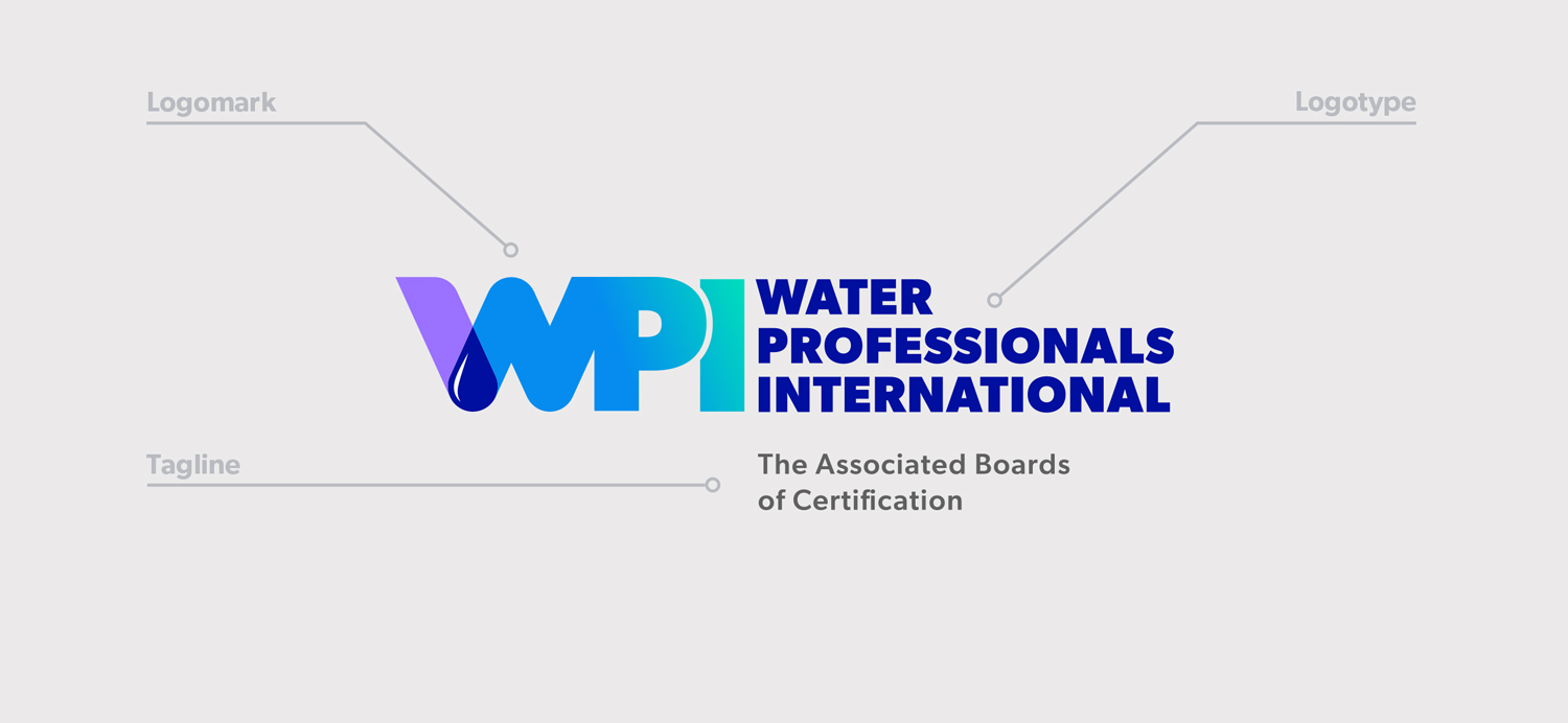
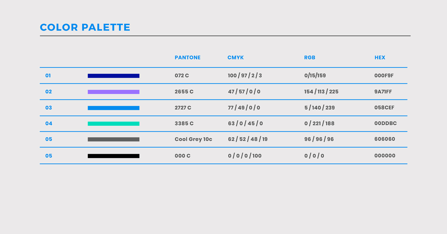
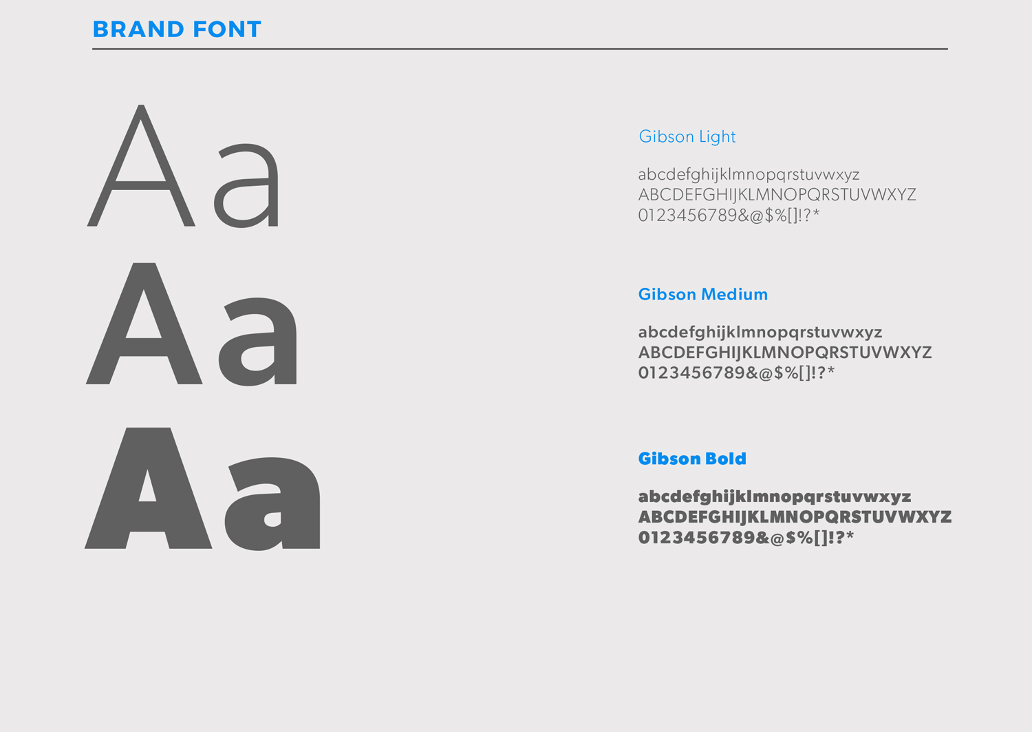
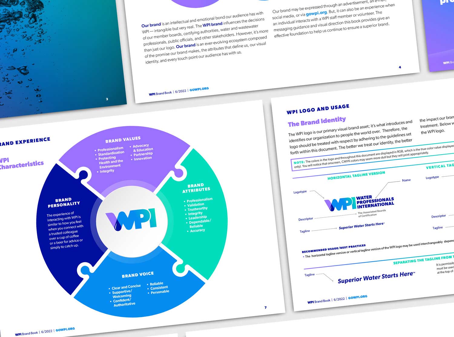
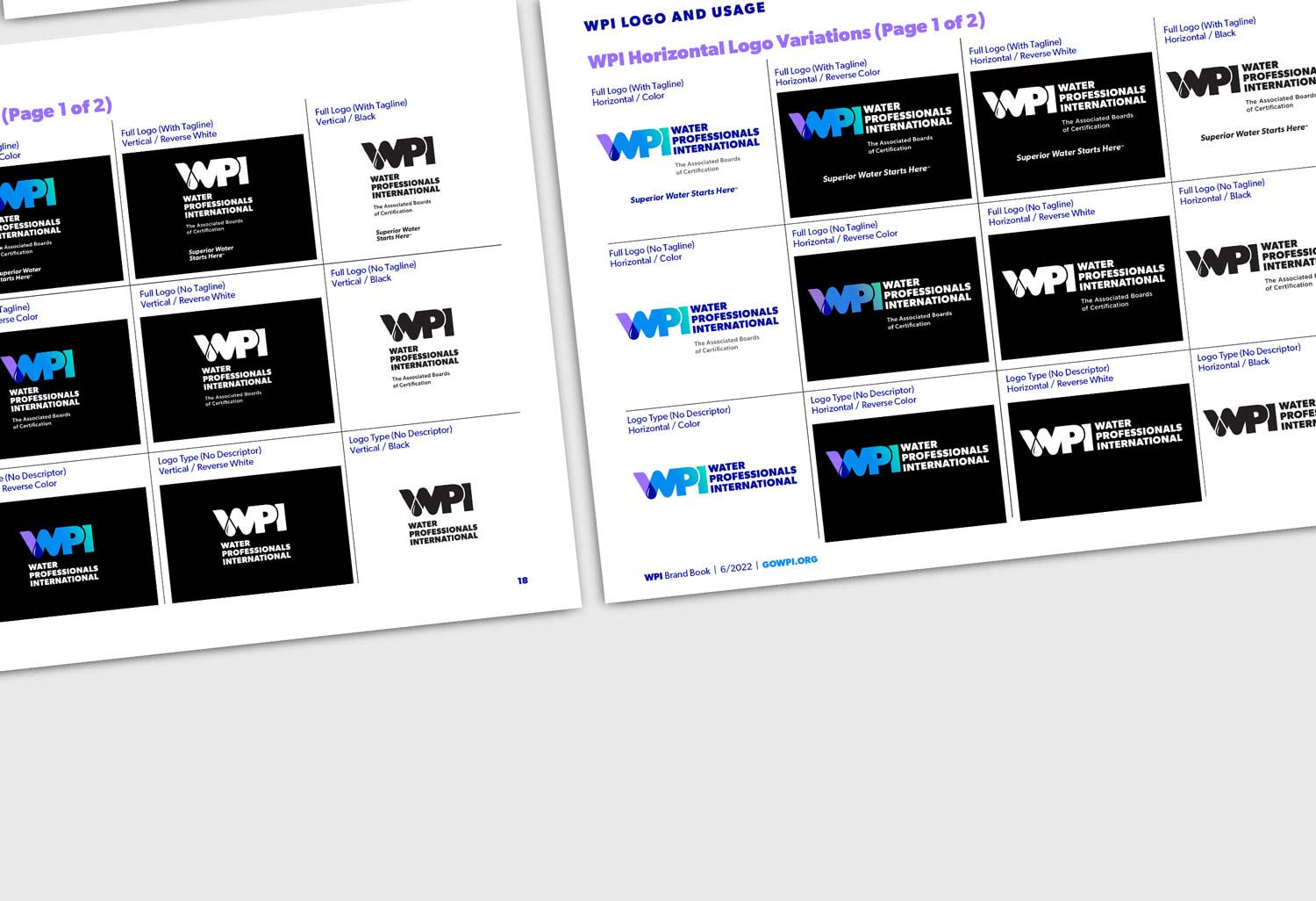
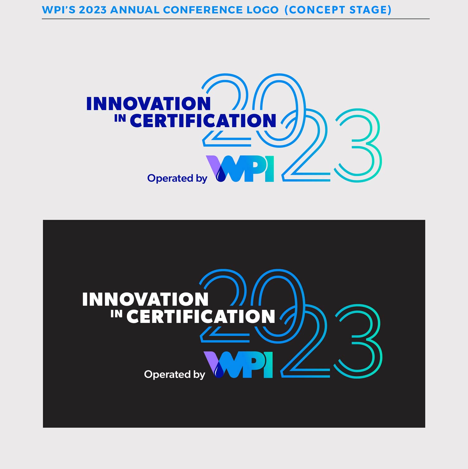
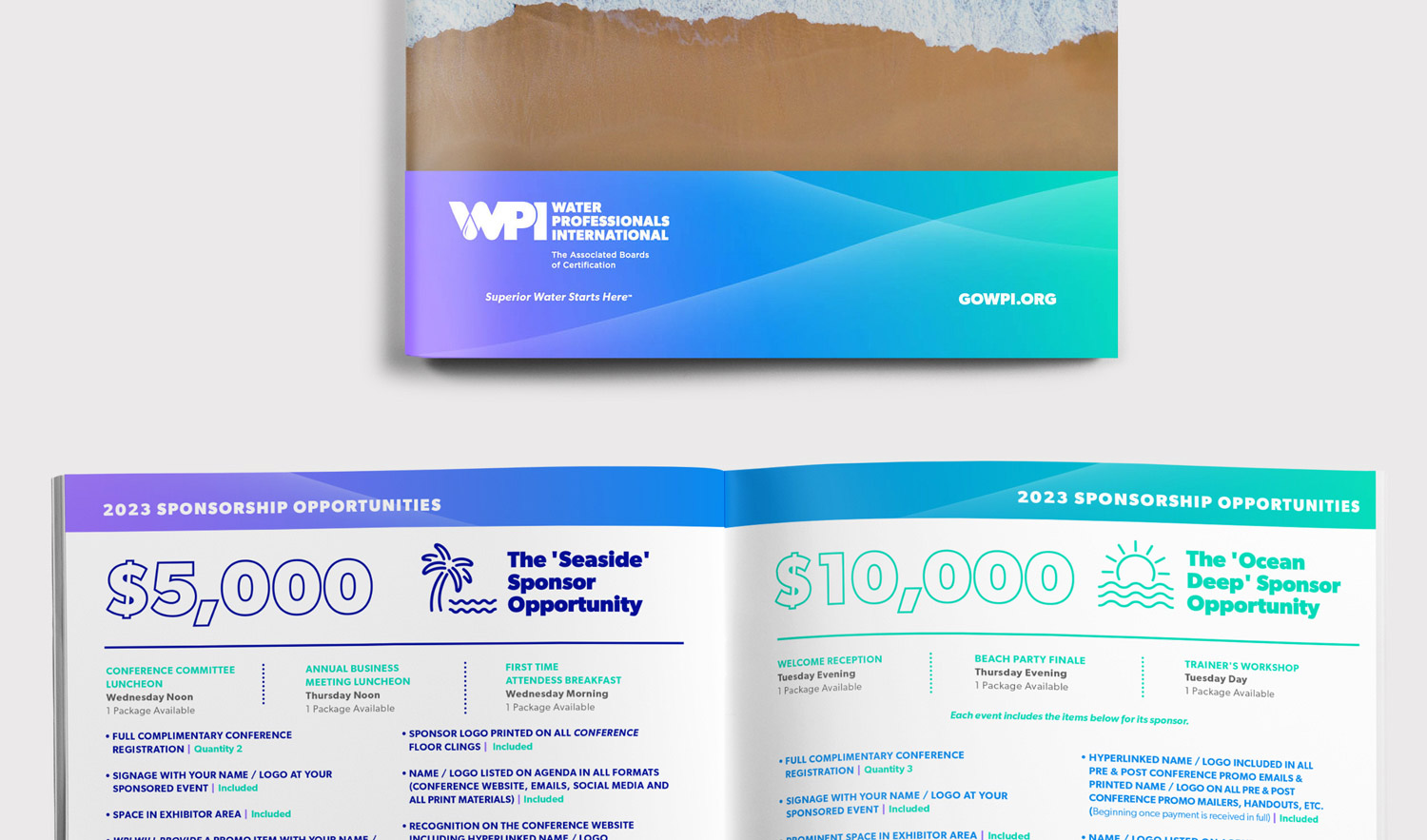
I led the creative, starting with a new logo: a water drop that symbolizes the transformation from wastewater (purple) to clean drinking water (blue), with green representing sustainability and environmental focus. Supporting brand elements featured fluid gradients, structured layouts, and a clean, modern typography system designed to convey movement, innovation, and professionalism.
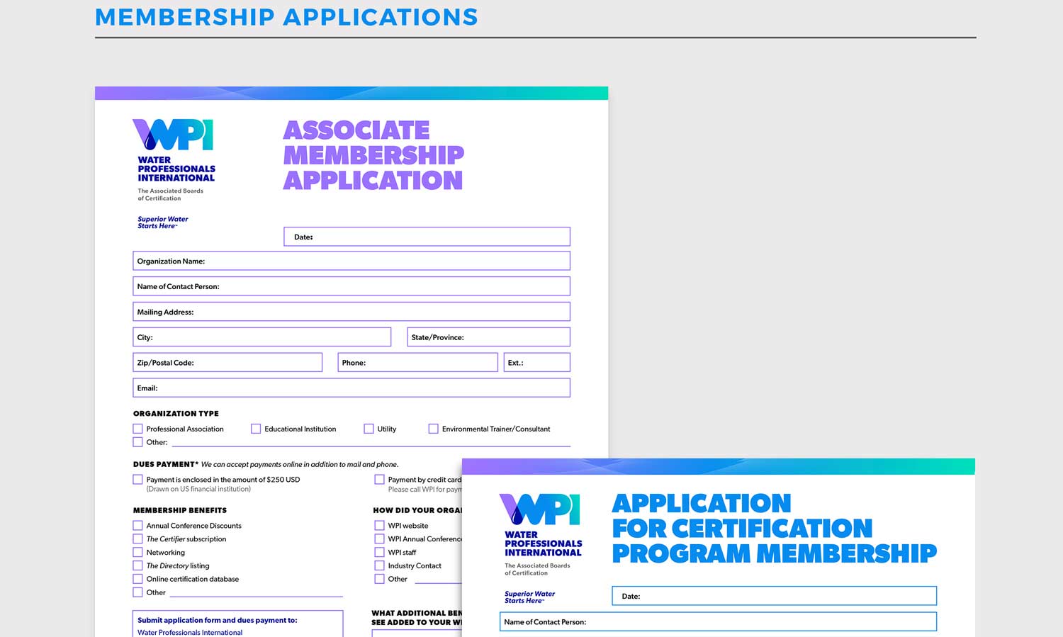
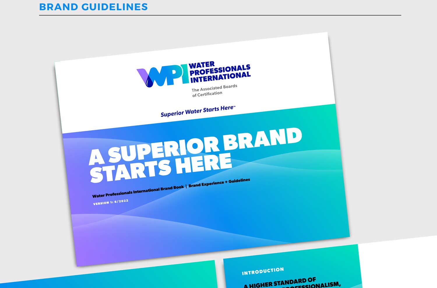
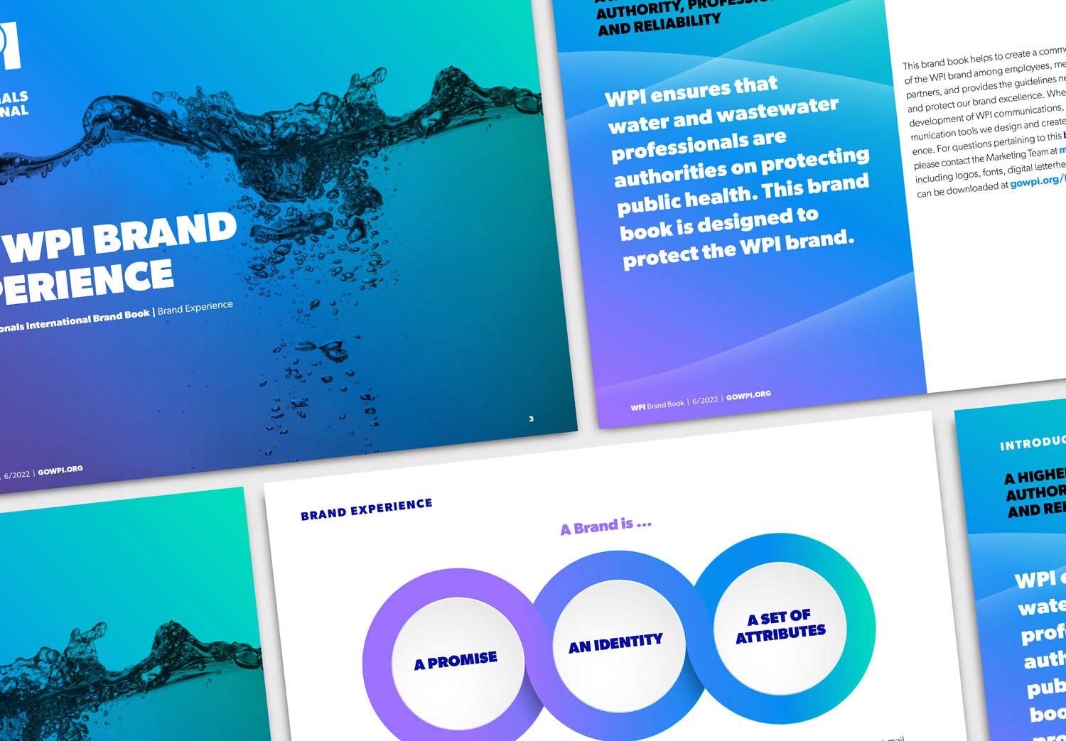
To ensure long-term consistency and adoption, I developed a 75-page brand guidelines document outlining logo use, typography, color systems, applications, and brand extensions.
Results
• 50% average increase in brand perception across five key brand attributes
• 43% increase in agreement that the logo reflects WPI’s mission
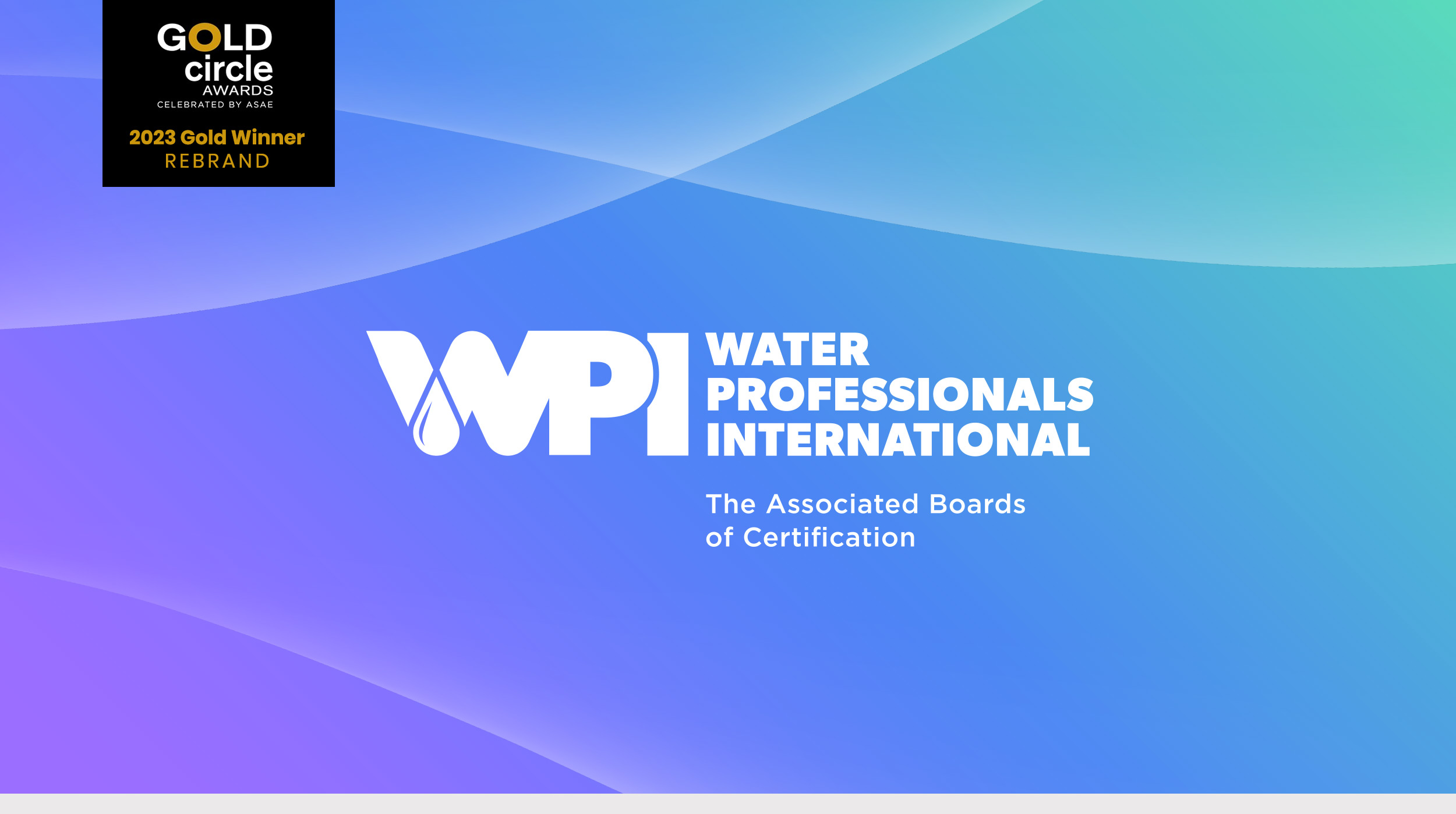
• Recipient of ASAE’s 2023 Gold Circle Award for Rebranding
Client
Water Professionals International (WPI)
Agency
David James Group (DJG)
Project Type
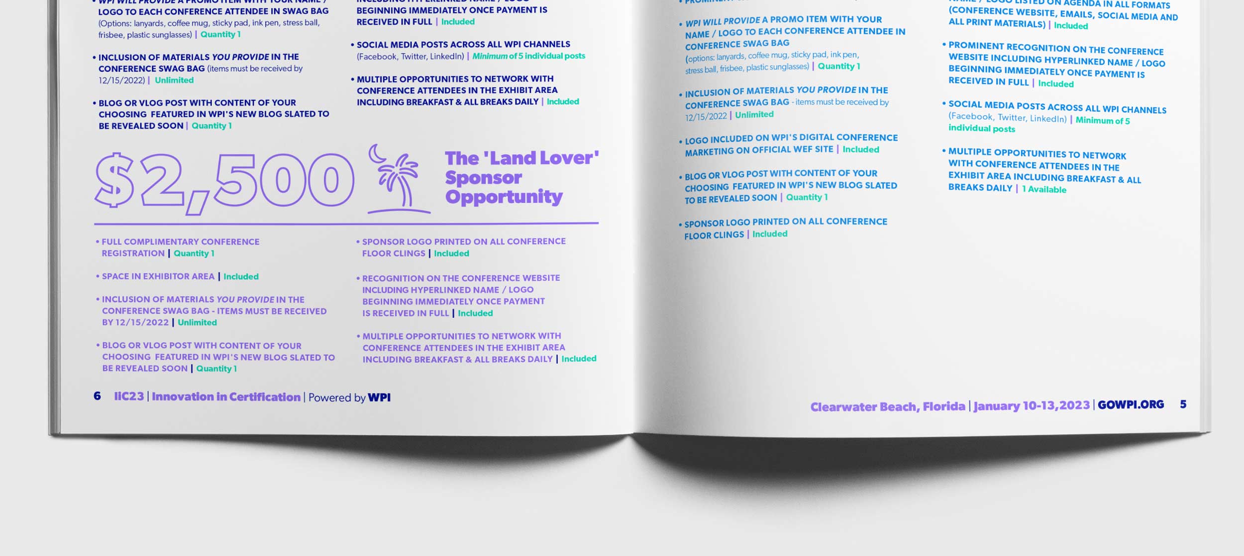
Rebrand identity, brand guidelines, social graphics, video, brochures, and tradeshow signage